|
||||||
| FAQ | Members List | Calendar | Today's Posts | Search |
 Topic Review (Newest First)
|
| Dec 9th, 2007 11:35 PM | |
| Cedar | Esuohlim has great typographic skills |
| Dec 9th, 2007 11:07 PM | |
| Sethomas | I made a font out of my handwriting back in 2000, but for whatever reason it doesn't seem to be compatible with XP or something. I never really tried to solve that problem! Also, it worked out to look much better than my actual handwriting because when I write in print (and cursive, for that matter) I don't tend to pay attention to stylistic conventions such as writing along on a level line. |
| Dec 8th, 2007 09:36 AM | |
| bigtimecow |
lol my font is dirty  thanks guys for ruining everything thanks guys for ruining everything and thank you esuohlim for one-upping me
|
| Dec 4th, 2007 08:50 PM | |
| Grislygus |
I have some alterations to recommend. Hahaha awesome |
| Dec 4th, 2007 08:03 PM | |
| Sacks | Milhouse backwards you are so fucking hep. |
| Dec 4th, 2007 01:07 AM | |
| Esuohlim |
I for one disagree with you DuFresne because I'm working on my OWN set of the rudest fonts in town I think by 2009 I'll have these bad boys completed for the public eye but I have a few kinks to work out yet you wait and see though
|
| Dec 3rd, 2007 08:19 PM | |
| Cedar | you are right, i take it back |
| Dec 3rd, 2007 06:31 PM | |
| DuFresne | Not trying to be confrontational, but I can't really think of how one would make a font very "original" or "not generic." After all, they still have to look like letters and be readable. Given that and also how MANY fonts are already out there, I don't really know if originality is what you should be looking for. It looks neat and that's really all you can ask for. |
| Dec 3rd, 2007 05:49 PM | |
| Cedar | I think it looks generic |
| Nov 29th, 2007 01:54 AM | |
| Eyelobe | I'm not sure how one goes about this font appreciation stuff, but I can say: I like your font. It is a good font. |
| Nov 28th, 2007 11:31 PM | |
| bigtimecow |
my font!! 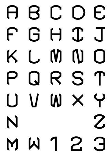 i'm still messing with a few letters, but i really like how it's coming out so far and wanted some opinions! considering i started out trying to make all the letters conform to a circular shape, this has come a long way |