i like it! are you designing your own fonts, or is it just the composition you're playing around with?
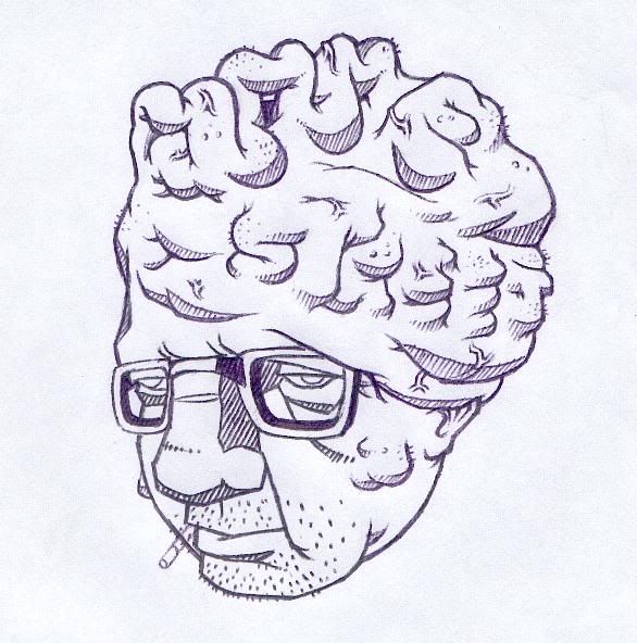
a mate of mine is setting up a website for street art (im not 100% on the name by the way but that wasn't my call). we were kind of bouncing ideas around and i thought it might be a good idea to make actual whatpastes for the bannerspace (or whatever you call it - on this site, the area just above the navigation bar where the i-mock guy is).
that way, instead of having a graphic design - OK, but a bit sterile - he could have a rolling stock of photos, with the site name incorporated into each poster design (my idea being the photos could be as much about architecture - placement of the poster in a certain environment - as the poster itself). below is one of my try-outs. its just an idea so some bits are very shit - the fag (or
cigarette 
), the bottom of the tumour to his left. but if you have any constructive crits (can't tell what it's supposed to say? i suck at thinking in 3D, i was thinking of trying to mould it in blu-tac first for reference or something. any tips?) please share.
or, if you have any ideas, throw them my way - i'm thinking of spelling it out with the intestines of a seppuku guy too, should be fun.