

Features

by: -RoG-
In the past, I've discussed in great lengths how important I believe that the poster and box art for old horror movies was absolutely crucial in getting people to rent them. If it wasn't for their awesome artwork, I probably never would've rented movies like The Video Dead or Night of the Creeps back in the day. But what about the art of horror video games?
With some video games, I found about them first in magazines like Nintendo Power, which actually showed screenshots from the games; but others I just happened to stumble onto while wandering the aisles of my local Toys 'R' Us. My obsession with all things Halloween and horror certainly extended outside of films, so every now and then I would find a new game that would stop me in my tracks because the cover art was screaming for my attention. With that in mind, I thought it would be fun to share some of my favorite pieces of horror video game box art with you today. Let's get started:

Ghosts 'n Goblins was one of the first games I ever bought for the Nintendo Entertainment System, and it was totally because of the box art. Fighting hordes of monsters in a graveyard? What's not to love? What's nice is they actually included some of the little details from the game on it - that tough little goblin even has the heart tattoos on its shoulders and the flying ghoul is ready to throw his tiny spear at Maximo. Top it all off with a totally 80s red and blue laser grid background, and you have one hell of a nice piece of ghostly eye candy.

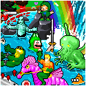
Not to be outdone by Nintendo, the Sega Master System had their own box art for Ghouls 'n Ghosts (the sequel to Ghosts 'n Goblins). This box was pretty incredible because the art style is not what you would expect a video game developer to use to sell a game. I absolutely love how this art looks like it was hand-drawn on a sheet of graph paper by some kid in high school during math class. It also features a nice image of our hero summoning his gold armor powers to thwart the first boss from the game - a giant cyclops monster named "Shielder" that tears off its head and shoots fireballs at you from its mouth. On the cover, he actually looks pretty happy and excited, but in the game he's a bit more menacing than that. Furthermore, why it's looming behind a tree and a trainquil little waterfall, we'll never know, but I like to think that if the artist had more space, he or she would've added in a drawing of Lucifer sitting atop a rainbow with a big smile on his face.

The TurboGrafx-16 was my first introduction to the Splatterhouse series, and it was all because of this box art. This was THE game that made me want the TurboGrafx-16 system when it first came out. And really, what's not to love? You have a mutant wearing a burlap sack on its head and chainsaw blades coming out of its hands while a Jason Voorhees clone (his name is Rick Taylor for those of you not familiar with the series) grips a 2x4, clearly ready to bash in some more skulls. Top that all off with an eerie candle-lit room featuring slime splattered on the wall and floors, and you have yourself one hell of a winning combination. I also love how the game literally dares you to play it with the blood splatter in the bottom left corner claiming it's not an experience for cowards. Well played.
To be honest, pretty much every Splatterhouse game has great box art, so maybe I'll get to them in future installments of this series.

It should come as no surprise that I'd be featuring this one. Of all the horror-themed video games that have ever been released, Friday the 13th for the NES made a big comeback in 2013, and it was all thanks to a fan named Will Edwards who created an awesome figure paying tribute to the old game which NECA was cool enough to actually release.
Toys aside, it didn't matter how bad the game was, because there was no way in hell any kid could possibly resist buying a video game where the box art depicted Jason Voorhees emerging from some kind of interstellar neon rainbow wormhole with an axe in hand. I still wish they had worked a scene like this into Jason X, because of all the Friday the 13th films, I'm pretty sure it wouldn't feel forced in a film where Jason is reanimated 400+ years in the future... in space. Hell, they even had a holodeck rip-off in the film, so they totally could've had him emerging from it looking like he was exiting a neon rainbow.
Well, it'll probably never happen on film, but we'll always have the original NES box and now the action figure to hold onto.

Nightmare in the Dark is one of the best games for the Neo Geo system, released by SNK back in 2000. It's also one of the most unappreciated ones, but I've always loved it. Essentially, the game is just like Snow Bros., but with a Halloween theme including graveyards, Frankenstein-ish monsters, and creepy old mansions. It was the cover art that caught my attention originally, as it featured a unique art style depicting some cloaked gravediggers, zombies, and a giant mummy-skull thing on wheels with huge blades stuck in its head. Keep in mind, this game was never officially released for home consoles, but I picked up the MVS (arcade) cart for it that came with this box cover. After seeing it, I had to know if that giant grinning skull with rotted yellow teeth was actually in the game, and was delighted to discover it was the stage 2 boss when I finally played it. All in all, it's a really nice inked comic style cover that definitely stands out from your average game box art.

Ah Chiller... such a twisted arcade game from yesteryear. In case you didn't know, the NES version is far more tame, and while it never received the coveted "Nintendo Seal of Approval", it did feature one of my all-time favorite pieces of video game box art.
First off, you have some beautifully hand-painted reanimated corpses rising from their graves, and these things look like they came straight from an Iron Maiden album cover (Eddie! Is that you? Run for the hills!). You also have a pair of skeleton hands bursting from the ground holding onto what looks like the kind of medallions you'd see a classic vampire wearing around its neck, or it could just be a fancy wine bottle cork from Pier 1 Imports. Lastly, you have a tombstone that reads the same thing everybody should have as their epitaph: DEAD PEOPLE ARE COOL.
You know what? That's so goddamn awesome I would buy the box even if it didn't come with a game inside; then again, if you've ever played Chiller on the NES, you could make a strong argument that it didn't.

Here's another one that no self-respecting horror game fan would leave off their list. Sure, Night Trap is far from the best game, but it's so infamous at this point that you'd think it was amazing from the smiles you'll see on gamer's faces at the mere mention of it. Aside from congressional hearings that resulted in the game being removed from store shelves (when will they ever learn that controversy will just make people want the game more?), Night Trap also featured Dana Plato of Different Strokes fame on most of the boxes since she starred in the game.
That said, I've always preferred the illustrated cover for the Sega CD version, because it looks far more professional and enticing. For some inexplicable reason, you have a group of mercenaries in a little bubble in the top left corner that look completely out of place, and you have a woman in lingerie terrified because some ghoul who may or may not be a member of the Foot Clan sneaking up behind her.
And what's in his hand? It looks like a computerized collar of some sort! Does it make her head explode!? Does it control her mind!? These were the questions we kids had to know, and so we bought Night Trap and were soon tortured into submission by the full-motion video footage throughout the game. Still, even if the "non-stop action!" tagline was a total lie and the violence wasn't even remotely intense as other full-motion video games like Phantasmagoria, the fantastic box art made Night Trap an easy sell. If nothing else, the b-movie quality video footage is always good for some laughs.

I'm a huge sucker for all the hand-painted art that the Atari 2600 / Intellivision era gave us gamers, and I always remember loving the box for Haunted House. Just look at it... you have not one, but three vampire bats all superimposed in front of some poor bastard's terrified face. That alone would be enough of a selling point, but there's also a big spider crawling on a web. Not just any spider either... a Garden Spider! When I was a kid, I always thought I'd grow up to be an entomologist, so I loved running around the yard identifying insects and arachnids. Naturally, the fact that they featured a non-aggressive Garden Spider that poses virtually no threat to humans on the cover of this game made it all the more amazing to me. Sure, the yellow and black colors look threatening, and it can weave some pretty incredible webs, but I assure you getting bitten by one of these things should be the least of your worries in this world - especially when a vampire bat trifecta is hanging directly in front of your face.
Perhaps the very best thing about the Haunted House box art isn't what is in it, but what's not in it... a haunted house.

No article about horror video game box art would be complete without Castlevania, and I've always been particularly fond of the original NES title that started it all. While Simon's Quest was easily my favorite of the Castlevania NES games, the original game always had the most striking box art in my opinion. First off, you have somebody in the foreground who looks like he may or may not be Conan the Barbarian armed with a whip, looking at the long journey that lays before him. Then, high atop a mountain lies a creepy old Castle, with bricks glowing in the moonlight as the giant, evil head of Count Dracula floats in the air behind it. Of course, having it all framed within those classic shiny silver Konami NES boxes made this awesome image all the more arresting. Honestly, you can't go wrong with any of the original three Castlevania boxes, but this one will always be my favorite, and I can say with absolute certainty that it's not just for purely nostalgic reasons. It's probably because I've always had this dream of whipping the semi-translucent, giant floating head of Dracula to pieces. Yep. That's gotta be it.

Based on classic b-movies including the giant killer ant flick "Them!", It Came from the Desert was a popular game back in the glory days of Amiga and MS-DOS. And just as the game itself took inspiration from all those cheesy old movies, the box art did as well. If it weren't for the sticker in the bottom left telling you that you'd need 1 meg of RAM (one meg!) and a joystick, chances are you'd think this was a genuine classic horror movie poster. Gotta love the random taglines scattered around too - "HEAR Teenage Girls Squeal!", "SEE Decent Americans Terrorized!", and "Presented in Thrill-O-Vision!" just scream of vintage movie posters, right down to the distressed font selections. Throw in a damsel in distress about to be devoured by a mutant ant, and you have yourself one truly fine example of horror gaming box art.

Monster Party's cover art has resonated for ages with me, and it's even the wallpaper on my cellphone. I can think of no greater endorsement for a video game's box artwork than the fact that I want to see it every single time I turn on my phone. I seriously love every single thing about this, from the purple spider web background and title font to the strange array of monsters... it's just perfect. I keep this box sitting next to me on my desk at all times, that's how much I love it.
And look at those monster choices! Sure you have Dracula and Creature from the Black Lagoon, but there's also Medusa, Audrey II, a Troll, and what appears to be a skeletal version of the Alien Queen. Definitely an unconventional mix of monsters, yet it totally works. My favorite thing about it though? I love how it appears as though the Creature From the Black Lagoon burst out into the front of the group at the last second for the ultimate monster photo-bomb. Classic.
Alrighty, that's all for now. What are some of your favorite examples of horror video game box art? I've barely scratched the surface here since there are tons of horror genre games out there; so if there's box art you'd like to see covered in a future installment, share your thoughts in the comments section below.
Also, be sure to read PART 2 & PART 3 for more horrific boxes!
Have any questions or comments about this piece?
SHARE YOUR THOUGHTS IN THE READER COMMENTS SECTION BELOW!
If you enjoyed this piece, be sure to check out:

The Bloodcurdling Box Art Of Horror Video Games: Part 2!
and

Follow us on:
![]()
![]()
![]()
![]()
Want Your Ad Here?
Send us an email!


[Features] [Shorts] [Games] [Comics] [Weeklies] [Blog] [Info] [Store] [Advertise] [Home]
![]()
Copyright © 1997-2025 I-Mockery Productions : All Rights Reserved : (E-mail)
No portion of I-Mockery may be reprinted in any form without prior consent.
We reserve the right to swallow your soul... and spit out the chewy parts.
Reader Comments
OLD COMMENTS:
Look out, Chris Redfield on speed! Those two identical ghost spiders are right behind you!
PS. I don't think Maximo and Arthur are the same character.
I picked up Yummy Mummy as well, but I can only eat so much cereal at a time, so I doubt I'll get to it until after Halloween.