

Shorts
The Amazing Covers of Sega Force Magazine
by: John Bower
1/27/18
When you were young, did you have a favorite magazine you liked to turn to when you were looking for information on the latest video games? Are you still young, and wondering what the hell a "magazine" is? If you answered "yes" to either of those questions, good news: you're in our target demographic!
Getting readers to pick your publication means doing something to distinguish your brand from all the other gaming magazines arrayed on the shelves at the grocery store. Intelligent, thoughtful analysis is hard to convey in a visual medium, though, so your only course of action is to come up with some compelling cover art. Something flashy to let the casual observer know that you cover games without being too controversial.
That's not what Sega Force magazine was about.
For a few short years, Sega Force captured an audience in the United Kingdom by drawing them in with the kind of artwork that made you think you were getting something more than just a bunch of game tips and kiss-ass game previews.
Things got off to a good start with Issue 1:

I can't even get excited about hearing Toejam and Earl rap because I'm too busy thinking about what kind of in-blasting I'll be reading about in Pitfighter. Look at the guy on the right, his head twisting painfully around after a powerful blow! And his opponent is so focused on him that his left jab to the chin goes way off target and hits the side of his neck! And don't get me started on how huge those hands are.
And quite a bold move to feature a shirtless knife-wielding man promoting an article about how much fun Galaga '91 on the Game Gear is going to be.

We've got a cover featuring a blood-drenched monster, and it's only the second issue! I have to imagine a fair amount of subscribing kids must have wet themselves at the sight of this bleeding monstrosity. I mean, look at him! Granted, the overall picture starts to look less fearsome when you consider his exposed brain. I guess having three nails on each finger isn't as great as you'd think. The artist must have been pretty pissed off when they told him he needed to insert a Pepsi bottle to promote some contest. Not that he didn't to a great job getting the blurry bottle to blend in seamlessly with the monster's claw.

First of all, credit to the editor in chief for having a cover story about Two Crude Dudes and Double Dragon, and giving the titular Crude Dudes top billing. Bold move.
The cover really captures the essence of two guys throwing people around and beating them with pipes, but what's the story with the lead guy's head? It's almost as big as his entire torso! Is this some sort of post-modern criticism on the part of the artist, informing the viewer of the crudeness of the dudes by showing a crude grasp of proportion and perspective?
Once again, though, the gritty action in the center is offset by what's going on in the margins. Nice job painting that rock, Flintstone. IT'S STILL FUCKING GREY!!

Just as an aside, I think Kid Chameleon should have been bigger than Sonic. Even the waxy, Roy Orbison-looking Kid Chameleon on this cover. You can tell he's campaigning to be Sega's new mascot in this image. Look at the support he's showing with that button: Sega rules, OK!
Purists might say that you never transform into an eagle at any point in the game. And neither was the Kid ever seen wearing a medic-alert bracelet. All these minor issues are just a distraction. Look, he has a tiny rhino in his hand! By the way, don't try to do that thing with your hand that he's doing.

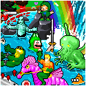
What the hell is going on in New Zealand?
Kudos to the artist for giving the kiwi an understated Rambo ensemble, but was it really necessary? Sure he has a little rocket arrow for his bow & arrow set, but he could wield a laser under normal circumstances. Furthermore, he missed a great opportunity to show the kiwi holding that big-ass knife in his beak. If you're wondering about the violent gang of children behind the kiwi, those were characters from interstitial comics within the magazine wherein kids would engage in video game-related battles within a futuristic city. I'd have been much more interested in those if they had ever been rescued by a macho cartoon bird with a rocket launcher.

This cover reminded me of those labels on bootleg toys that almost look like the real thing. Robotnik's eyes are still the same empty blackness as normal, but now he's much more slender and dressing like Steve Jobs. I can't tell if his head is bigger, or if his moustache is smaller, or both. Plus, he's riding in a helicopter. Robotnik never had to put a rotor on that thing! It was powered by a combination of a little rocket in the back and sheer willpower. I'd ask why there's no sign of Sonic the Hedgehog, but shudder to think of what Knockoff Sonic would've looked like.
Also noteworthy is that the header up top reads "110% action!" now. That's a 10% increase in action from previous issues!

Look at the details of this furious man. The drool dripping off his chin. The eyes looking in two different directions. The second "stealth" nose, hidden from view save for the tip peeking past the right side of the face. And those gums. Those gums! They look like they're getting ready to jump in if the fists can't do the job, yet his lips are fleeing in terror - they're so scared!!
But I've saved the best for last. The one cover that stands above the rest and says "screw your childhood, look at this":

A grisly depiction of a horde of children falling to their deaths, their eyes wide and their mouths agape as they look in horror at the ground speeding toward them and the splattered bodies of their compatriots below. What could this gruesome scene possibly be in reference to?
Why it's Lemmings, of course. The fun, light-hearted puzzle game where you guide a group of green-haired cartoon characters (as seen in the upper right corner of the Robotnik cover) across dangerous terrain to the exit. They can build bridges, they can dig holes, and unlike the children in this picture, they can die with dignity. There's only one way to describe a game like that: "EUURUGH!"
Sadly, they couldn't keep it going forever. In July of 1993, the magazine split off into a couple of other publications dealing with the Sega Master System and Megadrive (Genesis in the states), which puttered around for a few more months before ultimately being canceled. Some will suggest this had more to do with the decline of the SMS and complexities of the publishing industry, but the real reason couldn't be any more obvious: they stopped putting out the kind of ludicrous cover artwork that made people think the Megadrive was way more hardcore than it really was.
Drawings of hordes of people walking off a cliff like a Tom and Jerry meets Jonestown. That's what I miss the most about these classic gaming magazines.
Have any questions or comments about this piece?
SHARE YOUR THOUGHTS IN THE READER COMMENTS SECTION BELOW!


Follow us on:
![]()
![]()
![]()
![]()
Want Your Ad Here?
Send us an email!


[Features] [Shorts] [Games] [Comics] [Weeklies] [Blog] [Info] [Store] [Advertise] [Home]
![]()
Copyright © 1997-2025 I-Mockery Productions : All Rights Reserved : (E-mail)
No portion of I-Mockery may be reprinted in any form without prior consent.
We reserve the right to swallow your soul... and spit out the chewy parts.
Reader Comments
Seems like a horribly missed opportunity that they didn't go with the WWF microphone. Nothing would have tickled me more then having a demon Mean Gene.